ActionAid Hellas: enabling change in the midst of a pandemic

In March 2020, Greece went into an extended COVID lockdown. During this time, I also began a valuable collaboration; as a brand consultant with the not-for-profit organisation, ActionAid Hellas.
Fast-forward to November, and there exists a strong sense of déjà vu as Greece enters Lockdown 2.0, and I sit in my office to write this article, in which I explain the fantastic remote work achieved with ActionAid Hellas’ in-house communication team.
An inward look
ActionAid is an international not-for-profit organisation, whose humanitarian work spans the globe.
Famous around the world for its child sponsorship programme, which involved individual donors sponsoring a child in a Third World country to help support their future, ActionAid has since evolved.
Today, the organisation has changed its mission, aiming to make a true global impact by actively working towards a world free from poverty and injustice.
Active for over 20 years, ActionAid Hellas (AAH) is one of the oldest local branches of ActionAid International. Although it follows the joint mission of the international organisation, AAH has started to recognise the need for national focus, as Greece can also be defined as a country in need.
AAH’s inward mission became even more focused when Greece was hit by the economic crisis of 2010, which saw many families forced onto the streets. This was followed by the immigration crisis of 2018, which brought so many refugees (and corpses) to Lesvos’ shores.
In light of this significant mission shift, AAH decided that new brand architecture and effective communication were needed, to promote and support its activities in Greece.
Remotely together
I was looking forward to meeting the team involved in this project, in person at AAH’s Athens headquarters.
However, our plans had to change due to the pandemic, so we adapted our schedule and modus operandi to fit the remote environment forced by lockdown.
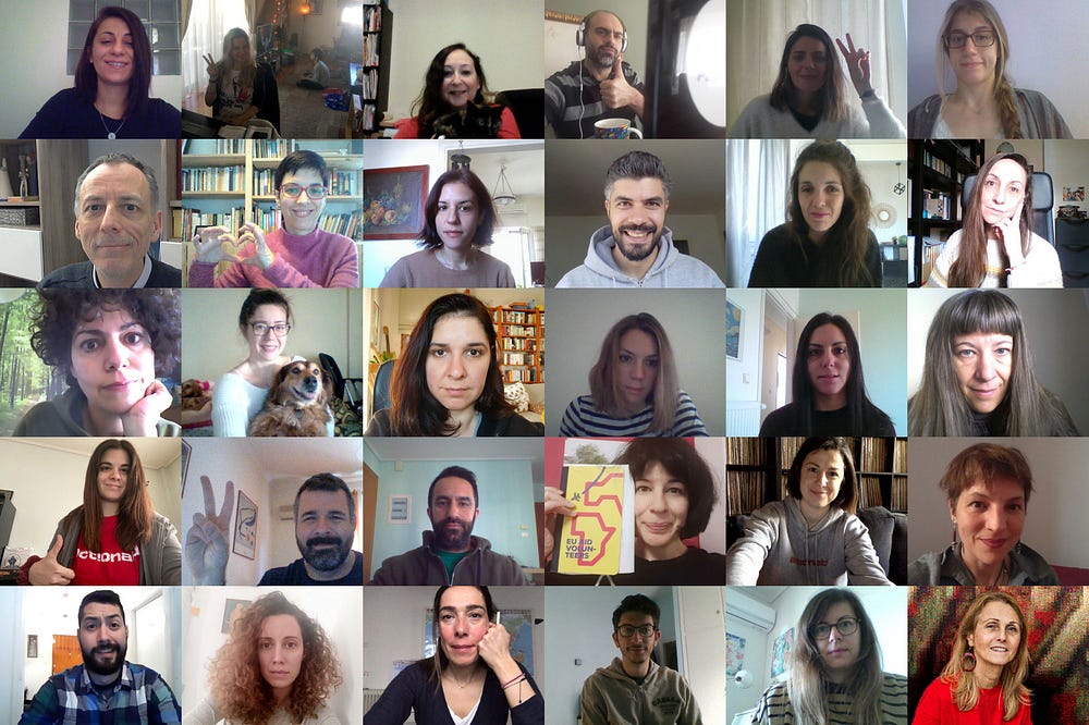
Together with the brand strategist, Zozetta Miliopoulou, we successfully ran a 2-day remote workshop with different departments in the organisation.
This went surprisingly well. All of the teams were keen participants, and even though we were working from our different homes, a strong group connection existed from Day One.
The workshop discussed the different weakness and strengths of AAH. It also helped board members and communication staff to identify and agree upon a more structured and focused brand architecture.
Also highlighted was the need for a new identity; one that could unify the different aspects of the AAH brand in one, distinctive voice that could speak to a broader Greek audience.
Old challenges for new goals
The workshop evidenced that, for many years, AAH faced crucial challenges in communicating its brand effectively.
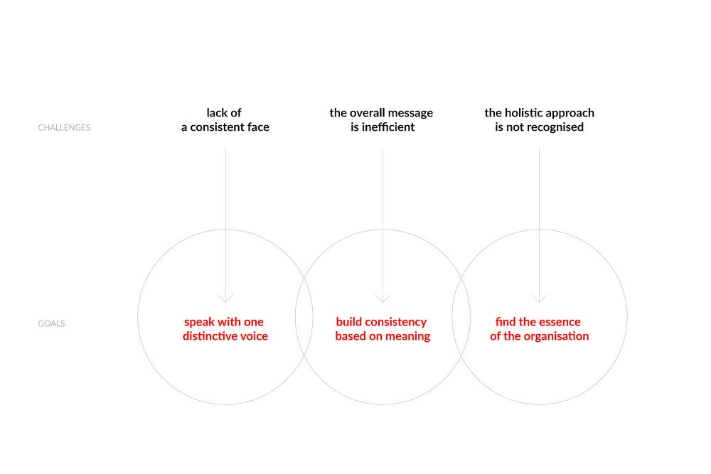
To specify:
- AAH was not presenting a consistent face to its supporters and stakeholders.
- Collaborators (both internal and external) were responsible for creating their own marketing campaigns. As a result, the overall message was inefficient, with frustrating and costly results.
- Everyone in Greece knows ActionAid Hellas for its Third World sponsorship programme, but most did not recognise the holistic approach of the organisation, on a national and international level.
To face these three critical difficulties, we established that the new brand identity for AAH should aim to achieve the following goals:
- Speak with one distinctive voice. Cut through the clutter to produce a vibrant, bold and unique brand message.
- Build consistency based on meaning. All elements of the new brand identity should follow a framework of sense and logic.
- Find the essence of the organisation. Create a high-level message that overcomes internal differentiation. Eliminate distracting references and focus on impact.
Embracing values
During our workshops, I challenged board members and different teams with my favourite exercise, the Onliness Statement made famous by Marty Neumeier.
If you have read previous posts about my work with brands, you will know that this is a popular tool in my analysis kit. (I find it both delightful and amusing, how such a simple exercise can bring so much clarity to a brand!)
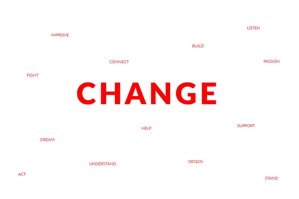
There were recurring words used to described AAH and its mission. However, we agreed that the organisation was connected to just one crucial value: change.
The message: change by meaning
Stood alone, the word ‘change’ is open to many different interpretations and directions. So, for AAH, we ‘contained the change’ by creating a framework defined by four devolved values.
These values are strictly related to AAH’s activities, mission, and beliefs.

Similar to a manifesto, the values constitute principles that drive AAH’s approach and communication.
Change is dynamic, which means it:
- Takes place on many levels.
- Inspires different activities.
- Represents different voices.
- Grows into the future.
In communications, this value is translated into the use of an agile layout that adapts according to different media and speaks many languages as one.
Change is deep, which means it:
- Talks about real people.
- Touches real lives.
- Influences thoughts.
- Overcomes opinion with facts.
In communications, this value represents the quality of the message: the ability to give perspective and depth to facts through storytelling (use of real images, adding dignity to the voice of the protagonists).
Change is memorable, which means it:
- Heals wounds.
- Forges memories (before and after are comparable).
- Gives power.
- Transforms forever.
For this reason, the AAH brand message needed to be straightforward. Its communication is characterised by a powerful and iconic design that inspires action and engages on many levels (look, feel, touch).
And finally, change is harmonic, which in practice means it:
- Happens together.
- Connects people.
- Adjusts to people’s strength.
- Follows a methodology.
- Happens slowly but consistently.
For the new AAH brand, this translates into balanced and focused communications that support conversation and adjusts to the specific audience and message.

Following these new guidelines, AAH’s tagline took on a more contemporary and holistic meaning.
Introducing the Sidelight
During the workshop, the first question I asked was: why should a volunteer, a donor, or a stakeholder choose AAH over another not-for-profit organisation?
I collected many compelling Onliness Statements. Unfortunately, less memorable and less remarkable was the standard method of communication.
I showed the board members their ‘current campaigns’, and they all recognised AAH from its logo, images, and red colour.

However, what they didn’t know was that I had switched the images of their campaigns with pictures of other, similarly placed organisations!
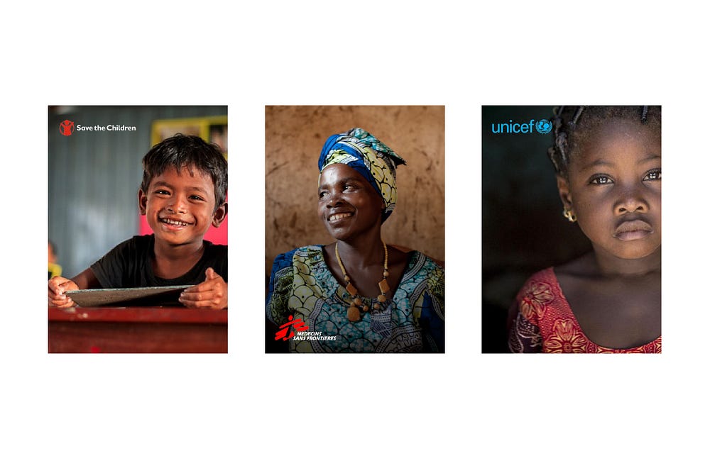
This realisation left everybody speechless: it was now unmistakably evident that their communication failed to encapsulate any of the four values of change agreed upon. There was no real differentiation between AAH and these other not-for-profit organisations, even if it was clear from our brand analysis that there were substantial differences in approach, and in methods of implementing change in larger communities.
The value “change” could not be defined only by the logo, the red colour, and the images; nor even by the font.
We needed something more inspiring and visually compelling, that could represent the values AAH extols within.
I then introduced a new graphic element into AAH’s existing identity, the Sidelight, around which visual elements could create more dynamic, memorable and powerful synergy.
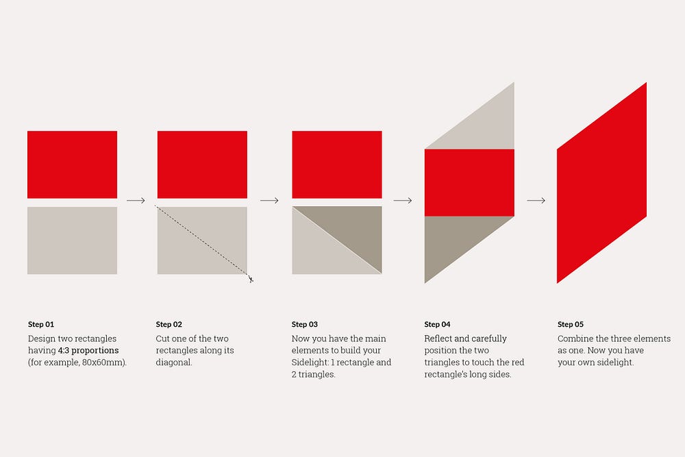
Today, the Sidelight is the most distinct and ownable asset of AAH’s identity.
It represents the ability of the organisation to be an enabler of change.
It is a passage that connects two different worlds; a window that is open to possibilities.
The Sidelight represents a journey towards transformation, and the capability of seeing problems in perspective.
It is a link between now, and what the future can be.

The relationship between the Sidelight and other brand elements could be infinite.
The creative team and I worked extensively on the creation of a brand manual to define what we termed “a controlled freedom”. This is an environment in which all collaborators (internal and external) could feel inspired, but also guided to create a strong and consistent message for the organisation.
The Sidelight and existing identity
Once we had defined the Sidelight, my work became that of a researcher, who interrogates herself about how to introduce a new element without disrupting the environment.
The Sidelight needed to relate to AAH’s existing identity, whilst also taking into account the wider identity of ActionAid International.
The brandmark and the pillars
With the introduction of the Sidelight, AAH’s exclamation mark (previously used as a decorative element) changed to become a more meaningful and active symbol.
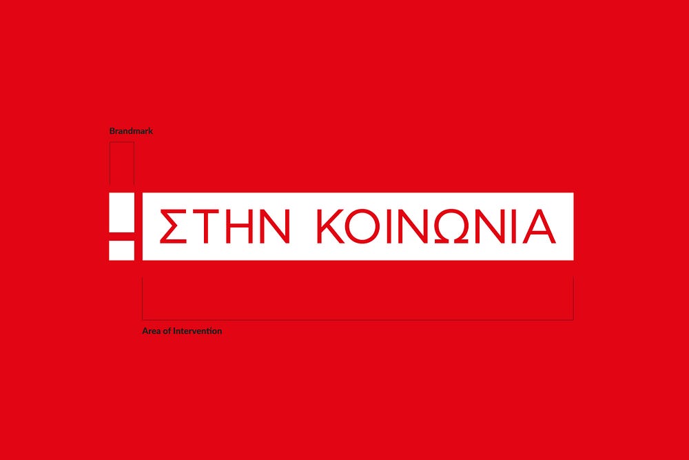
The pillars comprise two elements: the exclamation mark, and AAH’s areas of intervention enclosed within a rectangle.
The pillars introduce AAH’s areas of intervention, with greater focus on the methodology than the issues or countries worked with.
Today, it is used to mark different area of activities, or AAH pillars.
The colours
We borrowed the colours from ActionAid International and reviewed their hierarchy in primary, secondary, and complementary colours.
We agreed that ActionAid Red is a hugely important part of the AAH visual identity, which communicates passion and action, and builds recognition of its life-changing work.
When paired with the Sidelight, the red colour becomes uplifting, iconic, and disruptive.
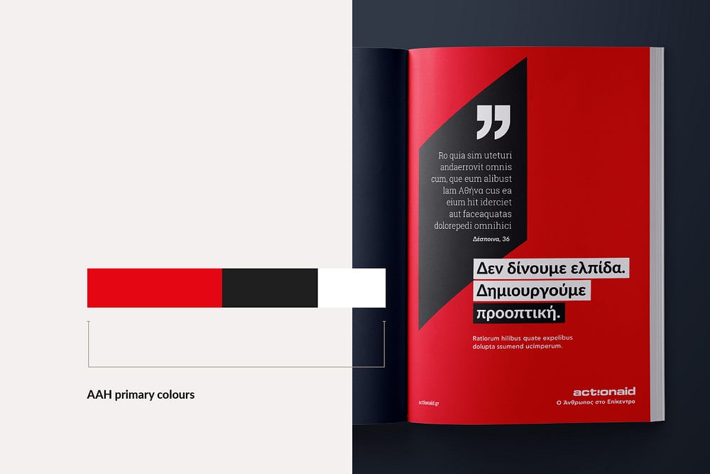
The two shades of grey were chosen to support the primary colour palette. The neutral colour palette is used less prominently, and to add flexibility to AAH’s communications.
The accents colours are used as highlights, and for less prominent communications.
We created a simple visual chart to restrain the overall use of colours across a single piece of communication.

The Typography
For many years, AAH was using CF Asty, a monolinear geometric typeface designed by Greek Digital Type Library.
This choice highlighted two important issues:
- CF Asty does not feature a correspondent font for digital use (at the moment of writing), leaving any collaborator open to myriad font choices for digital communications (such as website, dynamic banners, etc..).
- CF Asty is a paid-for typeface; hence any external collaborator must own a copy/licence which is impractical, particularly for unpaid volunteers.
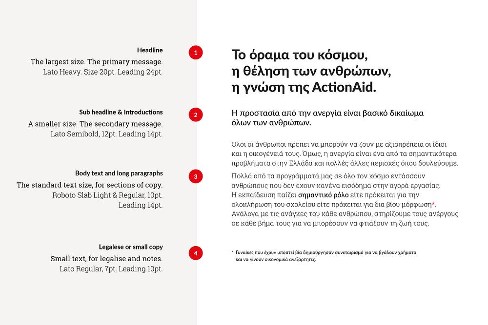
The creative team and I reviewed many Open Source typefaces and pairings, before deciding that the new AAH brand fonts would be Lato, paired with the slab serif font Roboto Slab.
Both Lato and Roboto Slab look amazing in Greek, and can be used freely in print and online communications. Both can also be downloaded from the Google WebFont platform for free.
Images
Many photographers collaborate with AAH, so it was important to instruct them in a style that captures and portrays the core brand values of ‘change’: dynamic, deep, memorable and harmonic.
To specify, the AAH brand message can be reinforced using images that have:
- dynamic context: work with real, un-posed, and vibrant images to create a richer narrative.
- deep and real emotions: to encourage empathy with the people depicted.
- memorable stories: provide context and visual references, so that if needed, a viewer can understand the image without reading the copy.
- harmonic integration: to show AAH were there, working together with communities and people.

While we know that donors respond to fundraising images that show a clear and strong need, AAH has decided to send a different message; reminding the audience that we can all be enablers of change.
Illustrations
The core brand values of ‘change’ also guide illustrators to create ad hoc illustrations for AAH, that allow certain flexibility and consistency.
To illustrate the principles, I have created some illustrations to explain how the Sidelight can be integrated in the narration.
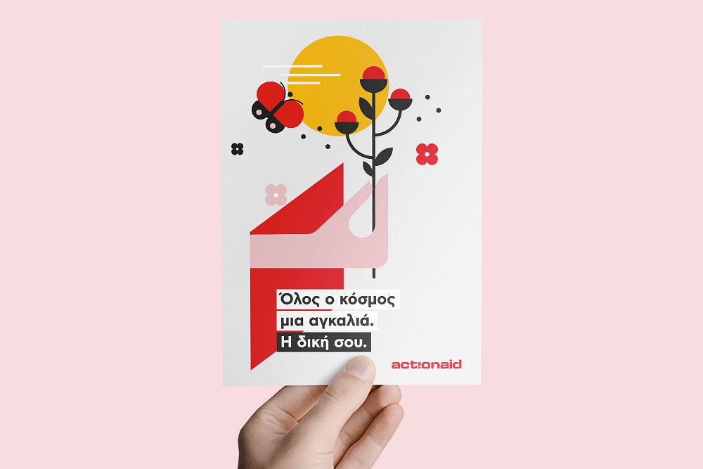
This was the most creative part of the project, in which designers are free to experiment with even more interactions and ideas.
We are all enablers of change
The new AAH brand identity is a tangible expression of everything the organisation stands for:
- It embodies what they do, how they do it, and why they are a trusted partner not only across the world, but also throughout the communities they serve.
- It unifies the different aspects of the brand, in a distinctive voice that aims to involve a larger audience.
But most of all, it focuses on just one, powerful belief: change is possible, together.
A special thanks to the Creative and Marketing department of ActionAid Hellas, specifically: Aspasia Kakari, Anna Botsoglou, Tasos Papaioannou and Marios Antonopoulos.
